Wednesday, 24 April 2019

Free Spirit


Hi everyone.
I am sharing a double page layout as DT member for FabScraps using the C114 Free Spirit collection.

These photo's are of one of my beautiful South American nieces and they suit this paper range perfectly!


The chipboard dream catcher was painted with Prima Marketing Finnabair rust pastes in Cool Grey, Taupe Rose and Cream until I was happy with the effect.


Afterwards I rubbed over the rough edges with Prima Marketing Finnabair ArtAlchemy "Vintage Gold" Metallique wax.

The title was embossed with gold embossing powder and I had some gold paisley rub-ons in my stash which I added to the background.


I added some script stenciling with gold Nuvo Embellishment Mousse.


I hope you like this layout and feel inspired to be a bit adventurous with some product and a paintbrush.

Until next time!
💛


Tuesday, 23 April 2019

Born an original


Hi everyone.
I am sharing a layout with you created with the oh so beautiful Mintay "Dear Diary" papers.

There's something about Mintay papers that make you want to use EVERYTHING (because everything is so pretty and beautiful) so I had to hold myself back with this layout 😃


I stenciled onto the background of this layout using a Penelope Dee rose stencil together with some Prima Marketing Finnabair Paper Texture Paste.


I fussy cut a lot of papers and elements out of the papers and layered them onto my layout.


The title was heat embossed with Wow! White Puff embossing powder.


Some splashes of white gesso and the layout was complete!

I hope you like this layout.

Here is another layout, using the same paper range, which a friend asked me to do for her daughter's birthday.  Lots of fussy cutting to surround the photo's and you can see for yourself how beautiful these papers really are ...


Until next time!
💗

You are the one that keeps me together


Hi everyone.
Today I am sharing a layout done for Penelope Dee using the Utopia range.

I love the fun, playful colours and elements in this range and it was easy to create with these papers.

This is a photograph of one of my nieces overseas with the love in her life and I felt that the pic suited this range perfectly.


I combined some of the papers on the background of this layout and then stamped some leaves using the co-ordinating stamp.  I then painted the leaves in different colours of watercolour paints to match the paper.

I also heat embossed some of the leaves in gold and then added them between the colour leaves.


There were lots of elements on these papers to cut out and embellish my layout.
Some splashes of peach watercolour paint and the layout was complete.


I hope you like this layout.
Until next time!
💗


Wednesday, 3 April 2019

You are an original


Hi everyone.  Today I am sharing a recent double page layout as Brand Ambassador 
for Penelope Dee, using the "Be You" range.

I love the colours of this paper ... the reds and the pinks with a touch of gold.

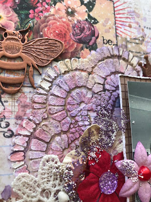
For this layout, I stenciled some hexagons on either side of my layout using a combination of "Pink Flambe" Nuvo Embellishments mousse as well as "Fire Ruby" Prima Marketing Finnabair Icing Paste.


While the pastes were still wet, I added some Gold Ranger Embossing Powder to the pastes, here and there, and then heat set the powder so that there would be "splashes" of gold.


The title and a few other embellishments were heat embossed with Gold Ranger Embossing Powder and then heat set again with some "Fuchsia" Utee Brightz Embossing Enamel which was added here and there on the chipboard.


I love how the pink embossing enamel melts into the gold embossing powder.
I will definitely do that again!


The cute little bees were also heat embossed in gold.


I hope that this layout has inspired you.
Until next time! 💗


Saturday, 23 March 2019

Dare to be Yourself


This is a single layout created for Penelope Dee using the beautiful "Be You" collection.

For this layout I used a photograph taken with a Snapchat filter.  Very dramatic!  

I love the colours of this range - different shades of reds and pinks - 
and wanted to bring purple in as a complimentary colour.

I covered my page with clear gesso and then stamped randomly 
onto the page using a copper ink.


I used the doily stencil, which goes with this collection, together with 
Prima Marketing Finnabair Paper Texture Paste and applied it thickly 
to give lots of texture.


Once the paste was dry, I added some sprays and inks, adding water so that it "moves" 
through the paste.  I added one colour at a time and dried with a heat gun 
inbetween each colour.

The bee was heat embossed with some copper ink.


The title was painted with different shades of Prima Marketing Finnabair rust pastes.


Some cut out hexagons and splashes of ink and the layout was complete.


I hope you like it.
Until next time!
💗


Friday, 15 February 2019

Friends


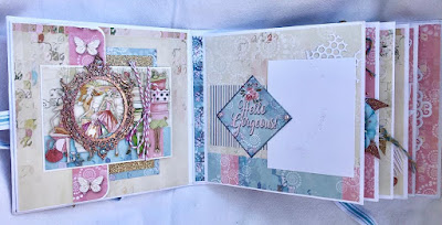
This is a mini album which I did recently using the FabScraps C113 Book Club range.
I love the pinks and blues in this range and the images which perfectly depict the craziness and love between girl-friends.

Pretty blue and pink flowers and embellishments as well as some heat embossing completed this album ...

and, of course, place for lots of photographs so that not one friend goes unnoticed.


Hope you like it 💗
Until next time!

Adventure makes the heart smile


And what exciting adventures 2019 is bringing!
I was so thrilled and excited to be included in the Penelope Dee Brand Ambassadors design team for 2019.  What an honour to work alongside such amazing, talented ladies who love the brand just as much as I do.  My heart is indeed smiling 💗


With all the above excitement, I'd like to share my very first project for Penelope Dee using their Indigo range.  What beautiful papers!  I am in love with all the blues and, when planning my project, yellow was a perfect complementing colour to add.
I created the background of this single layout by first preparing the page with clear gesso, stenciling onto the one side with Prima White Crackle Texture Paste and then adding the crackle paste here and there to create texture.  Once this was dry, I added Fossilized Amber Distress Oxide onto the page, over the stenciling, and then lightly spraying with water so that it would run.


I then stamped onto the stencil with the Fossilized Amber Distress Oxide, lightly spraying it with water before placing it onto the other side of the layout and transferring the Distress Oxide onto the paper in order to get the reverse stencil on the paper.

The two windows were painted in a combination of  Fossilized Amber and Faded Jeans Distress Oxides.


The title, which was altered by removing the word “laughter” and adding the word “adventure”, as well as the chipboard flowers were heat embossed with a combination of Cornflower Blue and gold embossing powder.


Once everything had been added to the layout, I dry brushed white gesso onto the background as well as over the flowers and chipboard embellishments and then rubbed Vintage Gold Metallique Wax over those some of the embellishments.

Some art stones and gold micro beads were added using gel medium. 

A few splashes of Distress Oxides and white gesso and the layout was complete!

I hope that this layout has inspired you.
Until next time!
💛


Sunday, 3 February 2019

Together


Hi everyone.  Summer is in full swing down in sunny Cape Town with a few heatwaves causing us all to melt.  Despite all the heat and the fact that we live so close to the ocean, we haven't been down to the beach once.  Crazy I know, but, even though I love to sit beside and watch the ocean, I'm not really a beach person.  Walking along the shores is okay once in a while, but it's not 
a favourite pastime of mine.

The pic in this layout is of my family during a spontaneous photoshoot and I love the pics that we got from it.

Even though I don't really like going to the beach, I love to do beach layouts.  I also love these 49 and Market papers (Island Paradise range) which I used for this single layout.


I used a lot of seashells, art stones, beads and flowers to create this layout, adding some splashes of blue ink and stenciling starfish onto the background.


The chipboard fishnet was heat embossed with silver embossing powder and then randomly painted with brown rust paste.


I brushed some white gesso onto the shells, flowers and embellishments and then added some extra pearls and splashes of white gesso to complete the layout.


Hope you like it! 

💙


Friday, 18 January 2019

Use your Wings


Hi everyone.  Today I am sharing a single layout using some beautiful Prima papers and products.

I used one of the Prima stencils which I bought about year ago and have not used it until now.  Well, I can say that I love it! and not sure why I haven't used it before.  We do that sometimes, don't we ... buy goodies which we like and then put them away without using them.  Crazy!


I tore the page in half so that I would be able to use both sides .. just because Prima paper is so beautiful and who can honestly decide which side is more so.

I coloured the chipboard and cut it in half to use on both sides of the photograph.


Splashes of Color Bloom sprays add the perfect effect with the stencil.


The wings are from a Finnabair mold which I used with paper clay, painted and then rubbed with some waxes.


And who doesn't love lots of flowers.  I finished off the layout by adding some art stones and other embellishments.


I love it and hope you do too! 

💗